5 tips for an attractive cover

The cover of your tour is the first thing that app users will see. It's what will entice them to tap and learn more about the tour before deciding to download it. That's why we recommend paying close attention to it.
Here are some tips to help you optimize your cover.
Tour name
- Mention your target audience
If your tour targets a specific audience, indicate it in the name itself. For example, emphasize the age range by adding: "(8-12 years)". - Don't mention the language of your tour
Tours are filtered by language within the GuidiGO application, so it's unnecessary to mention the language in the tour name. - Avoid overusing capital letters
A name written in capital letters isn't more distinct and may deter some visitors. Moreover, if your tour name is long and uses capital letters, it may be cropped on certain screens.
Cover image
- Choose an image representative of your content
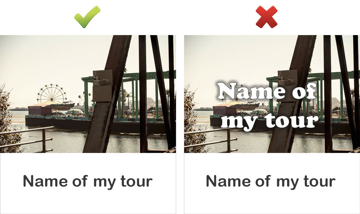
For instance, if you guide visitors through a vintage car exhibition, a photo of a gleaming Triumph car will draw more attention than one showing the hangar where the event takes place. - Don't put the tour name on the cover image
The tour name is already displayed below the cover image in the app. Maximize your cover area for optimal visual impact.